Even the most creative person has a project flop now and then.
That I have slightly more projects fail than succeed is a fact that I’m not going to share on this blog very often. I generally keep my art gone bad to myself, slipping it quietly into the waste basket with the outgoing pampers:)
However, to encourage all artists out there who have frequent artistic fiascos like I do, I’m going to share with you, just this once, one of my big ideas gone bad and how I rescued it. To put it over-dramatically: You will see the creative process soar at inception, hover pensively during assembly, crash hard, and then like the Phoenix of legend, rise again into something worth looking at.
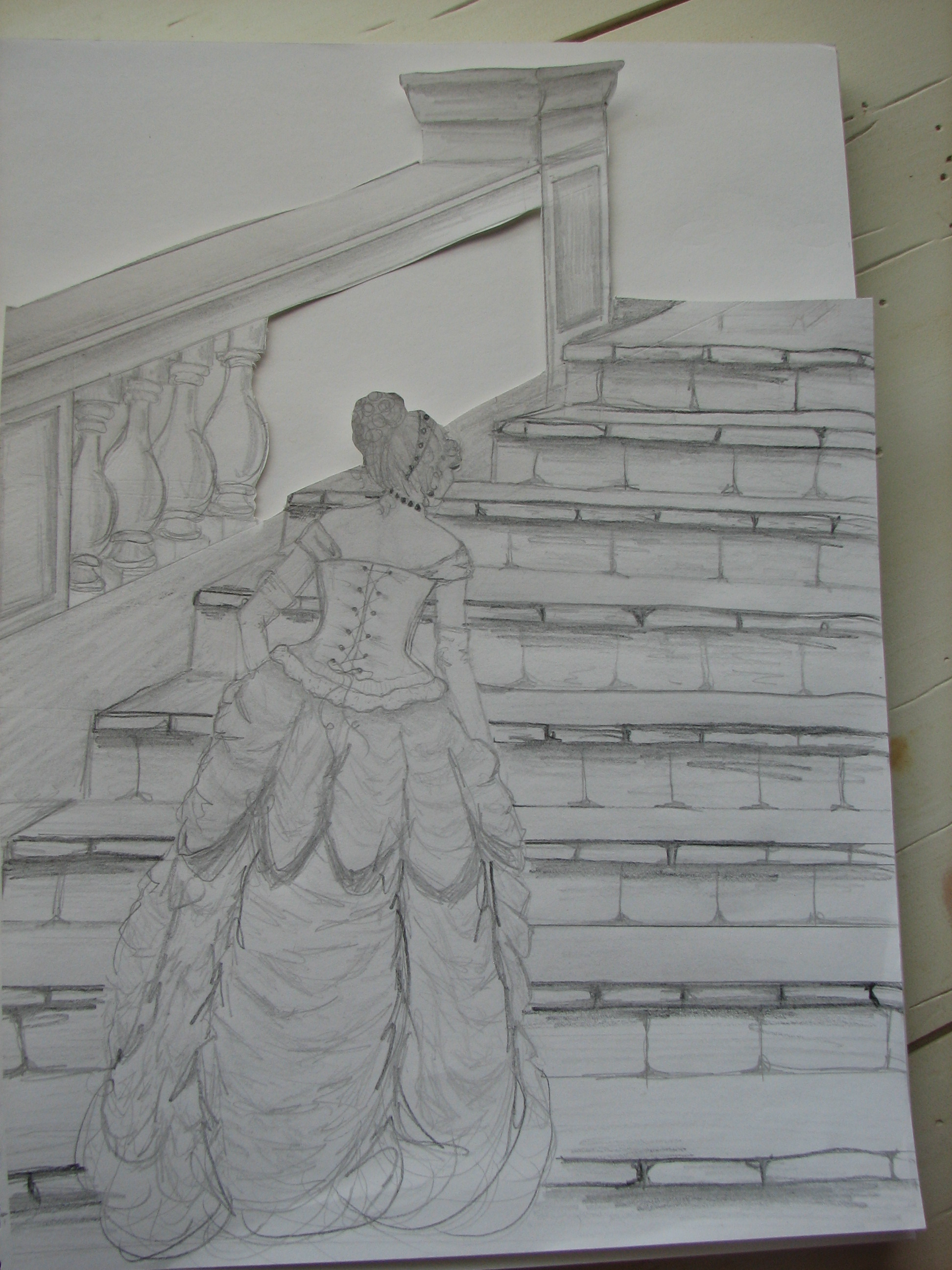
Here’s the drawing. Done much like many of my project drawings, I took a page from a wedding magazine and sketched it in my pad changing a few things as I went.
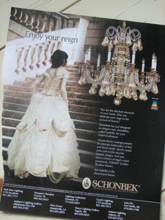

My big idea was to layer one of my drawings with some scenic pics from old magazines for an unusual 3-d effect. I envisioned something lovely, worthy of framing.
With an ex-acto knife I cut out the area in the drawing that I wanted the scenery to show through..
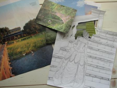
Next, I went through some old magazines and found a few pretty pictures of outdoor scenes.
Now for the part I imagined was going to be so magnificent–experimenting with different scenery behind the drawing. I tried the mountains first…
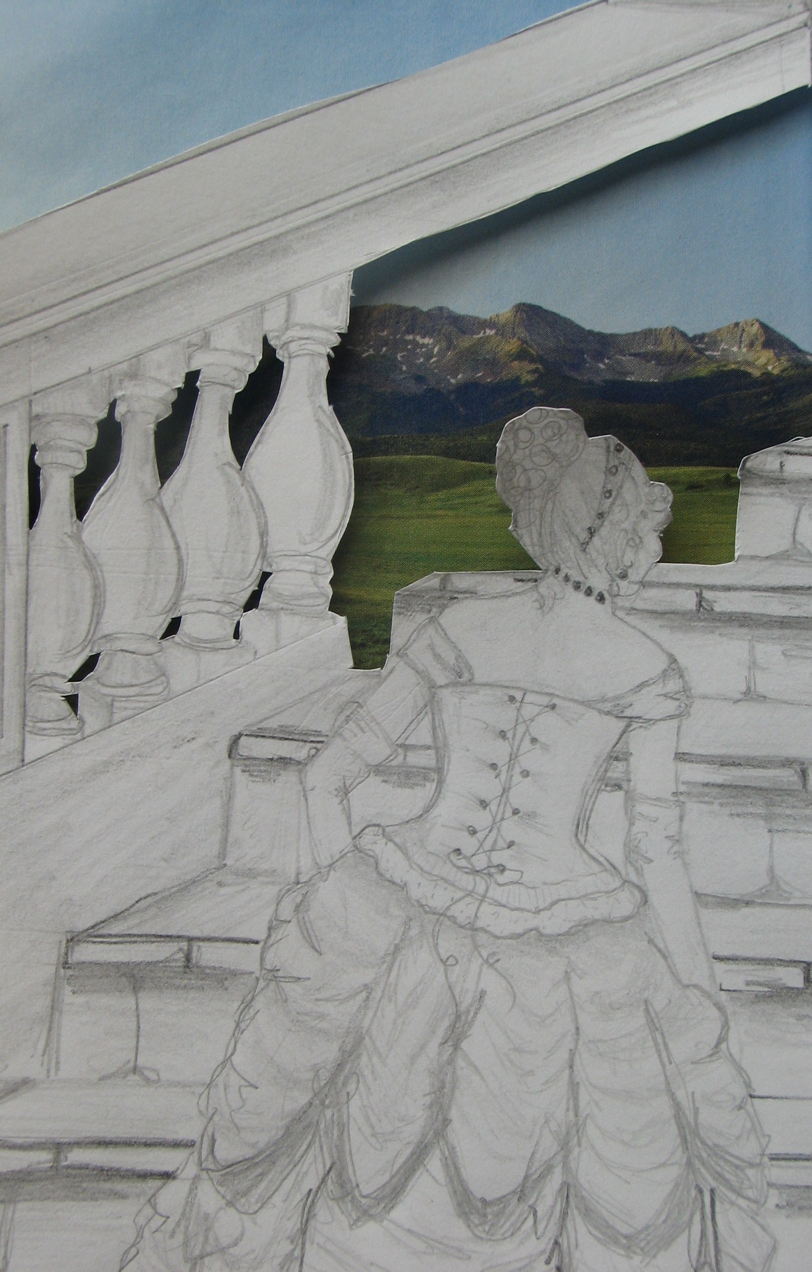
hmmm..not exactly what I was looking for here…maybe it would look better with a water scene.
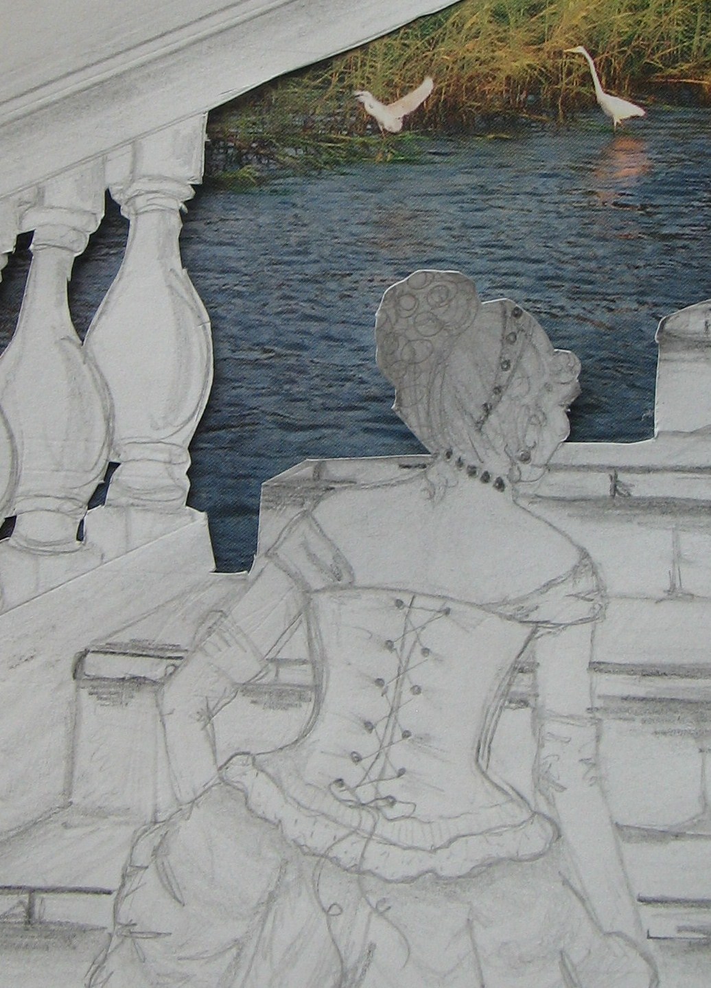
Nope, that’s not it either. The scale is off and my scanner isn’t working to fix it. Maybe if I added a more traditional background…
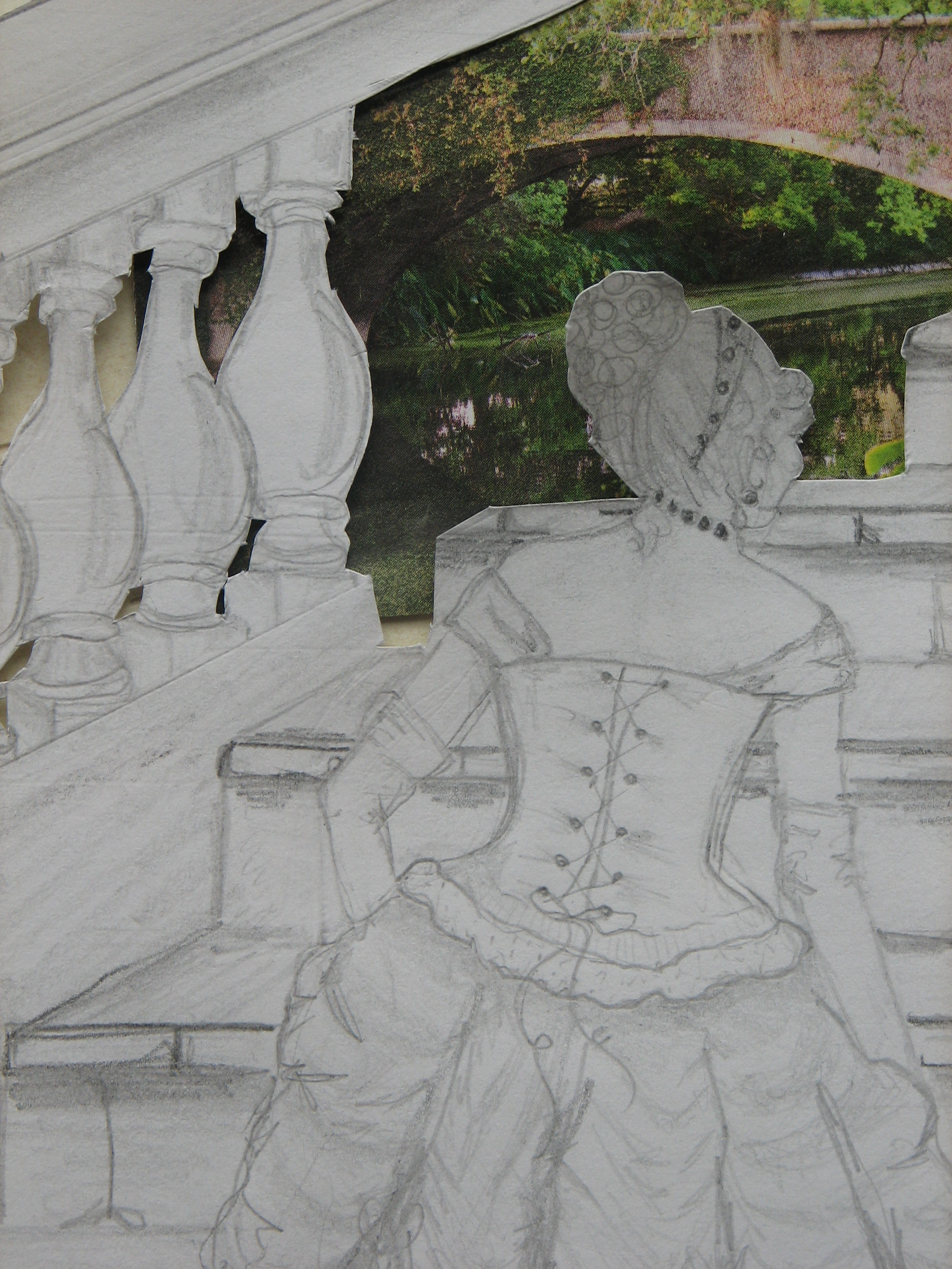
What was I thinking? This is not working. In my mind this was supposed to be really cool-looking. I realize at this point that the drawing needed to be MUCH better for this to work.
Even still, I thought the drawing was too pretty to throw out so I edited it a little and saved it with all the other “future banner” images I’m hoarding for my new blog.
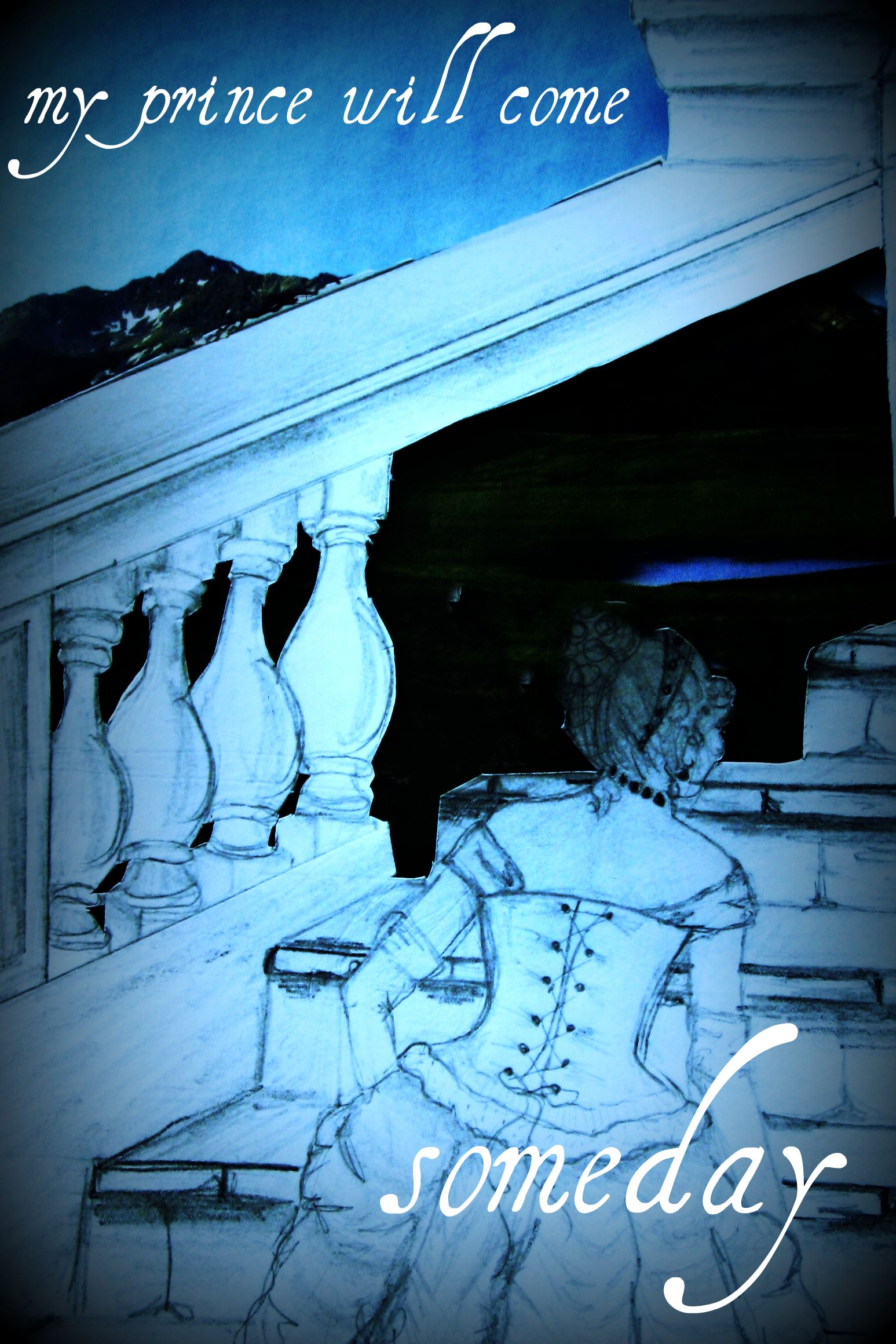
This turned out kind of interesting but I still wanted to do something with the drawing itself.
I cut out the lady and added some color with inks. Then I took one of my magazine pics of a woodsy garden and, carefully cutting along some of the branches, made a place for her head to slip behind them. I really liked the way this looked. This was more in line with what I had originally envisioned.
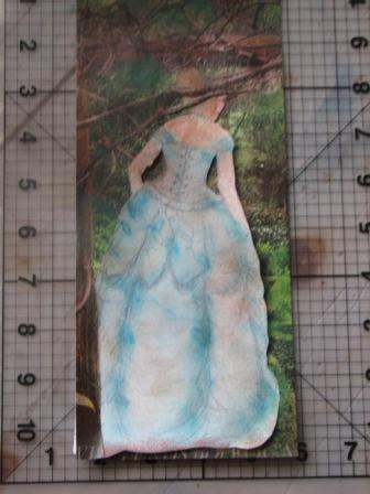
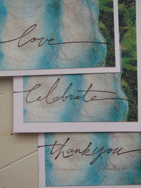
Then I remembered some very long, narrow white cards I had bought at Michael’s a few years ago. The long figure of the woman in the dress would fit on these! I color copied the image three times and, as my photography instructor likes to say, “cropped them into greatness”. Then I glued them onto the cards and stamped my favorite word stamps from Stampin’ Up towards the bottoms of the cards.
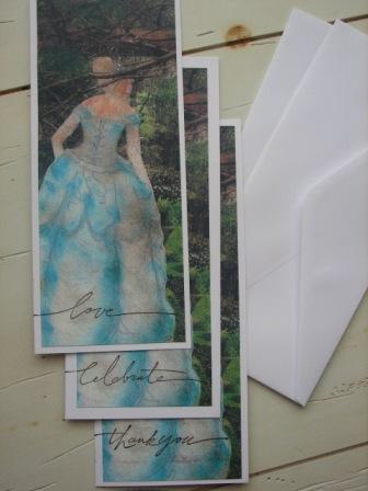
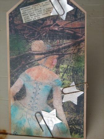
Finally, I cropped one more copy, added the words ‘shimmer’ and ‘shine’ from an old French dictionary and some shiny silver stars attached with rusty old paper clips (I have a thing for rusty paper clips right now-I think they look neat), and made a tag to go with them.
I wrapped them in a heavy weight piece of vellum and fastened the ends with double-stick tape at the back, then wrapped some ribbon around and attached the tag! Ta-da!
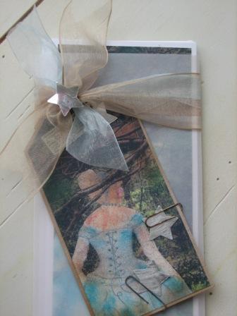
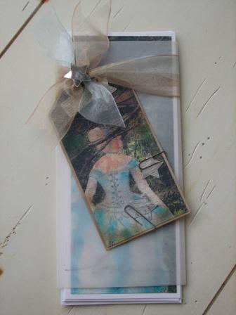
So there you have it-anything can be rescued with a little cropping and a few rusty paper-clips. Well…..almost anything.
OK, Mr. GK :), I love the way you “cropped” this picture. The card idea is GREAT!! It offers a subtle feel while an enjoyable beauty at the same time.
My shock started when you put the exacto knife to your drawing! (Can you tell I’m not an artist?) All I could think of was how long the drawing must have taken (because it would’ve taken me a LONG time).
Thanks for sharing even your “flops” with us — you are inspiring me to find the time for creativity this year.
I hope you are feeling better!
S-
Yeah, I usually don’t cut drawings up like that. It was just part of the “idea” that bombed ultimately. This morning the two pics of the finished product were missing so I re-added them back to the bottom. Thank YOU for taking the time to stop in and look! See ya!